Guide to CSS Box Model
Understand the content area, padding area, border area, and margin area in an easy way.


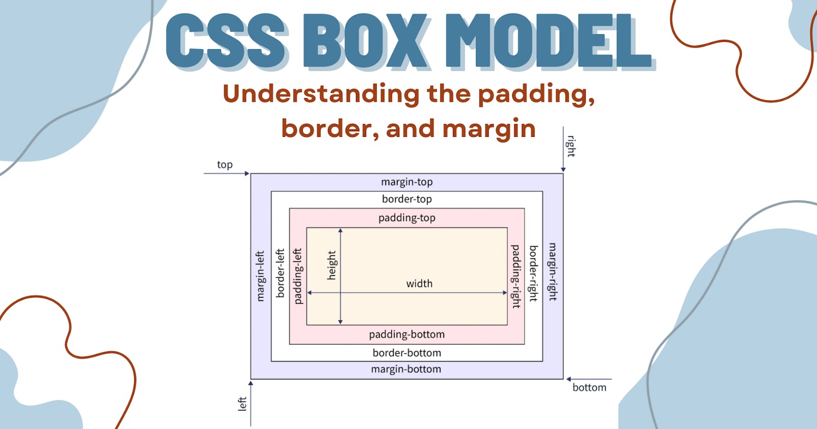
What is the Box Model?
The box model defines how elements are rendered on a web page. It consists of four components
Content
padding
border
margin
Before we explore the CSS box model, let's examine how the content is organized on the webpage by default.
Every element on the webpage is a rectangular box. There are two types of elements in HTML
Block-Level Element
Inline Element
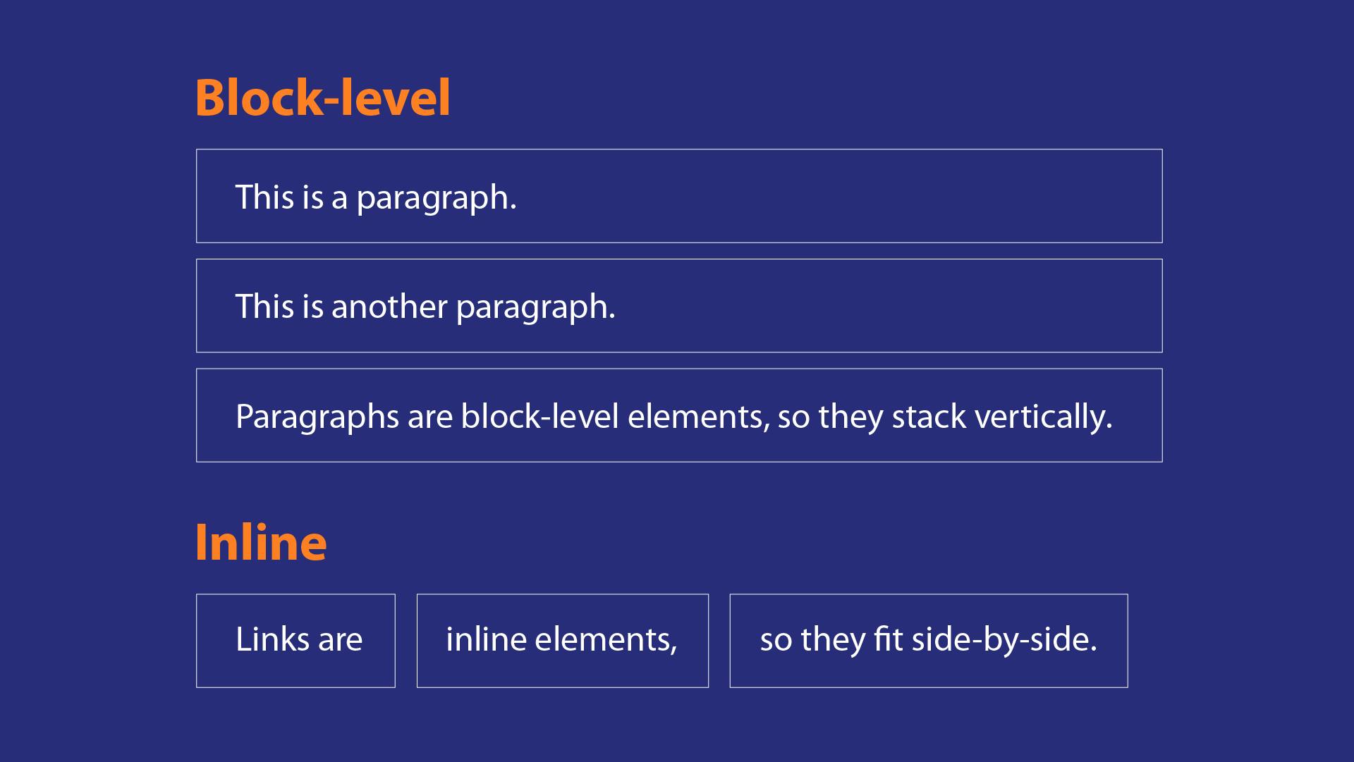
Block-level element:
Block-level element occupies the entire horizontal width of the webpage. Height is equal to the content height. Always starts with the new line and it will not have any other element next to it. Block-level elements can contain inline elements. The width and height of the element can be set.
Inline Element :
The inline element takes width according to the element. It doesn't start from the new line. It can have more than one inline element in the same line. The width and height of the element can't be set.
Now we understood how the content is organized on the webpage by default and the types of elements with an example. Let's dig deep into the CSS box model.
The size of the box is calculated like this,
Width: width + padding-left + padding-right + border-left + border-right + margin-left + margin-rightHeight: height + padding-top + padding-bottom + border-top + border-bottom + margin-top + margin-bottom
What if these values are not declared?
By default, all the elements on the webpage take some default value from the browser. You can also set it to zero by using CSS reset.
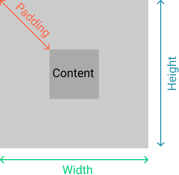
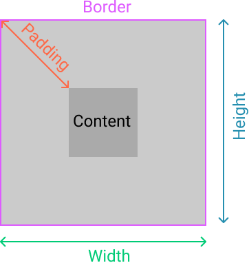
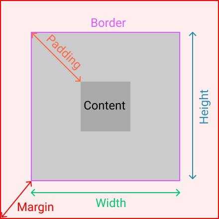
Content area:
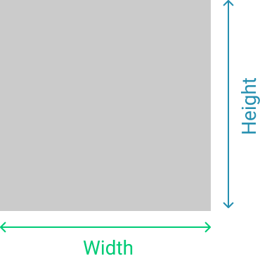
It contains the elements such as text, images, audio, and video. It is the region on the webpage where the content is displayed on the webpage. The dimension of the content can be modified using height and width.
Padding area:
It is the space around the HTML element and within the element's border area. It creates space inside the element's border and uses the same background as the elements. The dimension of the padding is modified using padding properties. padding-top, padding-right, padding-bottom and padding-left . Shorthand notation is padding
Border area:
It is the area between the padding and the margin. Its dimensions are given by the width and height of the border and the style is controlled by the border properties. such as dotted, solid, dashed, etc. borders can also have rounded corners using the border-radius property.
Margin area:
It is the area outside the element's border and it doesn't have any background color. The margin wraps the content, padding, and border. Margin is used to separate the element from the other element on the web page. The dimension of the margin is modified using margin properties. margin-top, margin-right, margin-bottom, margin-left, and shorthand notation is margin.
Example:
Other than content, padding, and margin we have some other properties which affect the look of the elements on the web page. They are display and border-box.
Display:
As we know every element on the web page is a rectangular box. The display property determines how that rectangular box is displayed on the web page. The default value for all elements is inline. Display property affects the box model because the display of the element varies based on the display properties.
| inline | It is used to display an element as an inline element. |
| block | It is used to display an element as a block element |
| contents | It is used to disappear the container. |
| flex | It is used to display an element as a block-level flex container. |
| grid | It is used to display an element as a block-level grid container. |
Example:
display: block;
display: inline;
display: inline-block;
display: flex;
Box Sizing:
The way CSS handles padding, width, and border individually has been a subject of a question in the CSS community. There are two types of box-sizing.
content-box :
border-box
let's consider the above code as an example,
content-box:
This is the default value of the box-sizing property. In the content-box mode width and height includes only the width and height of the element. Other box-model properties are not included. however final width and height of the element include the element's width and height, padding, border, and margin.
In the above example, let's calculate the final width of the element. so width+padding+border = 200px + 5px + 10px making it 215px wide.
border-box:
In the border-box mode width and height properties include element, padding, and borders width and height together. In the above example, let's calculate the final width of the element. If we set 200px width then it included element + padding + border width within the 200px. The element box will shrink to absorb that extra width.
Note:
According to MDN, it is often useful to set box-sizing to border-box to lay out elements. This makes dealing with the sizes of elements much easier and generally eliminates a number of pitfalls you can stumble on while laying out your content. On the other hand, when using position: relative or position: absolute, use of box-sizing: content-box allows the positioning values to be relative to the content, and independent of changes to border and padding sizes, which is sometimes desirable.
Conclusion:
In this article we have learned:
Every element on the web page is a box.
Types of elements.
Box model properties content, padding, border, and margin.
Display properties.
and finally box-sizing.
I hope with the knowledge of the box model, you can control the layout of the web page, and you will display the element correctly.
Thank you for taking the time to read this article 😊. I hope you found it useful and gained some knowledge. I would highly appreciate it if you take a moment to like 👍, comment ✍️, and share 🔁 it.
Happy Learning...! ✌️✌️✌️